Sentinel playground 2- Quick flood mapping

Following my previous article about satellite imagery for beginners, I got an e-mail from Olga from EOS, an innovative new company in the US (and with part of the team based in Ukraine), that represents the new wave of startups focused on the exploitation of satellite data. Olga asked me if I’d be interested to check their online geobrowser , Land Viewer, and provide some feedback. It took me more than 2 months (apologies for that) to check on it, but with so many recent events happening around the world (floods, fires…) and finally some spare time, I’ve decided to give it a go.

As a quick introduction, EOS provides more than a geoportal, they have build an entire platform that has more capabilities: it runs on their proprietary engine (EOS Engine), that allows users to process and analyze large imagery datasets, from a variety of sensors, while all the magic happens in a cloud environment. This means less local storage, parallel processing, a collection of dedicated algorithms for data analysis and fast visualization. All the capabilities are available separately as EOS Vision, EOS Storage, and EOS Processing, and the user interface Land Viewer, for data. All these form the EOS platform and can be used for any kind of application based on imagery. Pretty neat!

To test it, I chose a simple case study. Recently, villages along the Râul Negru river (Black River) in the Covasna county, Romania experienced some devastating floods following days of rain. I was curious if the Sentinel 1 imagery could reveal something. Although is a review, the point of this article is mainly showing you that anybody can use this wealth of data nowadays for getting information fast and with a minimum of effort.

Step 1 – Go to LandViewer

First of all, you’d need to register. I chose to do so using my Google account, therefore the process was fast and I avoided the hurdle of remembering yet another password. Next thing you’ll know, you’d be here in the Land Viewer, a very friendly interface for searching and visualizing.

lv.JPG

What I’ve noticed so far:

  • the interface is very responsive – moves well, visualization is quick and scenes load fast.
  • a lot of options to choose from – you have many buttons and menus, that allow you to perform all the basic needed operations (from including your own AOIs, to performing actions on the selected scenes.
  • quick access to your account and other features of the EOS platform – useful if you want to perform multiple actions in the platform and manage your data.

All in all, I can compare it with the EO Browser of Sinergise, which is by far the most similar product.

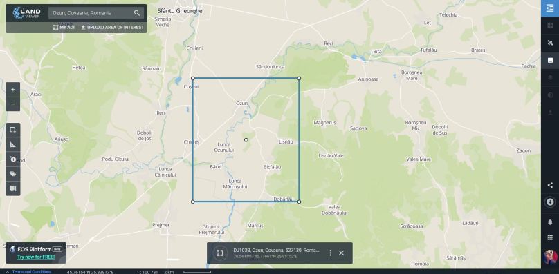
Step 2 – Choose your area

In the search bar located in the upper part, you can search for the location of interest, in my case, Ozun. Other options include Uploading an AOI and there is even an AOI manager. Using the drawing buttons on the left, I’ve defined a pretty small AOI around the village.

aoi.JPG

Step 3 – Choose your sensor

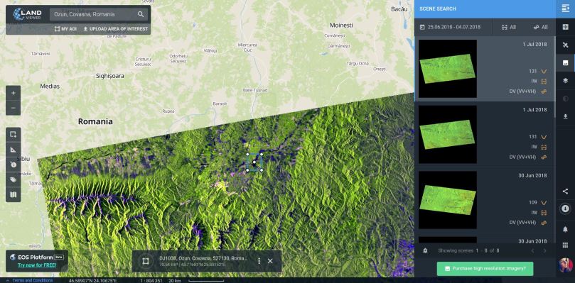
Flood mapping can be done using any sensor, but since flood is caused by rain and rain means clouds, traditional mapping of the affected area is performed using radar sensors. Since recently, LandViewer started to support Sentinel 1 (among a great variety of optical sensors) and I had to try that. From the Sensors panel, activated by the little satellite button on the right, choose Sentinel 1. Upon selection, you’d be automatically redirected to the Scenes manager, where the entire collection will be displayed. For visualizing on the map, simply click on the convenient scene.


Make sure you select only the scenes that you are interested in. With a free plan you have access to maximum 10 scenes per day, and visualizing apparently means selection. For this tutorial, EOS has provided me with a temporary key to the Pro Plan, which allows unlimited scenes and comes with a subscription of 499 USD/year. However, even with the free plan, you can access all the functionalities and for simple analysis, can be enough.

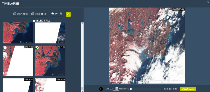
Because I was looking for flooding that happened on the 1st of July, I had also to filter the dates. In the Scene manager panel, you can choose your temporal interval in order to correspond to your needs. Since Sentinel 1 has a 6 days revisit time, my dates were 25th June- 4th of July.

scene.JPG

Step 4 – Visualizing the flood extent

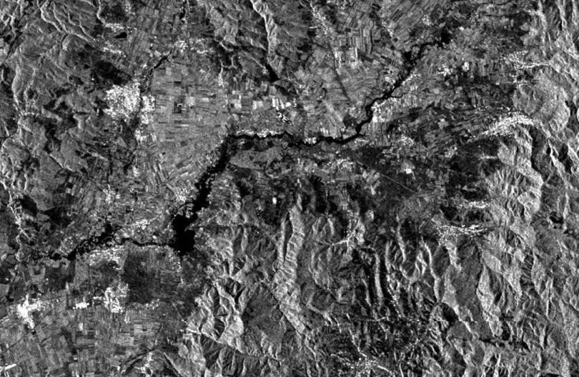
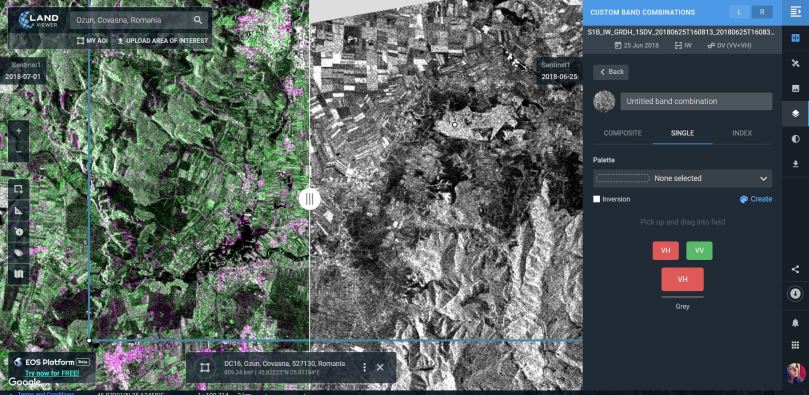
After determining my two scenes, the one on the 1st of July, and the one on the 25th of June (consider overlap and ascending or descending mode), I used the Slider button on the right, and chose my first image (1st of July) on the Left and my second image (25th of June) on the Right. Two L/R buttons should appear next to Scene Search. Using these buttons we will customize the band view, as scenes open in an RGB combination by default.

By clicking on the L and R buttons, I’ve chosen to see only the Band containing the Amplitude in VV polarization. This will help me delineate the area better and see the extent of the flood with much more accuracy.


Sentinel 1 is a C-band (5.407 GHz) SAR (Synthetic Aperture Radar) that is capable of imaging the Earth in dual polarization mode. Many of the acquisitions are done in the VV & VH mode. Even though all the polarizations are suitable for flood mapping, backscattered signal. Clement, Kilsby and Moore (2017), performed a great comparison of using different polarisations for inundation mapping. They also argue about the suitability of the VV & VH polarisations for such applications (with the cross-polarized VH causing more classifications errors due to the interaction of the signal with vegetation and VV introducing “more roughness” due to wind/rain effects leading to the poor identification of the flooded area). All in all, VV polarization seems to perform better in identifying flooded areas.

https://eos.com/landviewer/?lat=45.78752&lng=25.89306&z=13&s=Sentinel1&side=L&slider-s=Sentinel1&slider-id=S1B_IW_GRDH_1SDV_20180625T160813_20180625T160838_011532_01531B_2740&slider-b=VV&slider-anti&id=S1A_IW_GRDH_1SDV_20180701T160857_20180701T160922_022603_0272EB_3330&b=VV&anti

Another good combination would be the VV(R), VH(G), VV(B) band combination that is also included in the predefined options.

https://eos.com/landviewer/?lat=45.78835&lng=25.87933&z=12&s=Sentinel1&side=R&slider-s=Sentinel1&slider-id=S1A_IW_GRDH_1SDV_20180701T160857_20180701T160922_022603_0272EB_3330&slider-b=VV,VH,VV&slider-anti&id=S1B_IW_GRDH_1SDV_20180625T160813_20180625T160838_011532_01531B_2740&b=VV,VH,VV&anti

Step 5 – Play with bands

Land Viewer comes with the great possibility to create your own custom band combination, band ratio (index) or visualize a single band in different color palletes. The options are more advanced that on any other platform I’ve used so far, and they are worth investigating. If you’re interested, go to the Custom tab, click on the New band combination and choose from one of the three options. In order to define bands, just drag and drop. In the Single version you can also create your own palette.

palle.JPG

And this is not all. Using the Contrast streching button, Histogram stretch is possible in browser, which is one great feature I have not encountered in many online platforms, or if I did, it certainly didn’t offer so many options.

Step 6 – Analysis

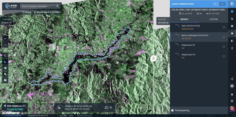
What we can observe when sliding in the two snippets is that the flooded area corresponds to the left bank of the river, in the low area of the “flooding plain”. Soaking moist soil can already be seen on the June scene and is an indicator of the topography and of the reduced capacity of water retention of the soil. A very rough estimation of the area affected can be done using the measuring option.

area.JPG

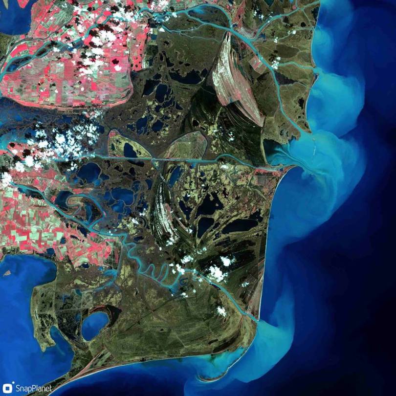
Since the platform supports various sensors, I was curious about seeing how the area looked like after the clouds cleared. I was lucky enough to find a good scene taken by Sentinel 2 over a part of the AOI, where you can clearly see the extent of the withdrawing waters. The two images are not 100% collocated, but the shift is not great and you can still see how the flooded areas coincide.

https://eos.com/landviewer/?lat=45.75818&lng=25.76277&z=13&s=Sentinel2&side=R&slider-s=Sentinel1&slider-id=S1A_IW_GRDH_1SDV_20180701T160857_20180701T160922_022603_0272EB_3330&slider-b=VV,VH,VV&slider-anti&id=S2A_tile_20180703_35TLL_0&b=Red,Green,Blue&anti

Conclusions

All in all the Land Viewer is a great instrument for performing a quick visual analysis. It is also great for people with little exercise with satellite imagery, but who wish to have rapid results. The geobrowser itself comprises many features that can be both for beginners and more advanced and the collection of sensors (both operative and archived imagery) is good. Much more advanced processing can be done using the EOS Processing tool, but still, Land Viewer is the starting point. Moreover, you can showcase your results using the convenient social media buttons that help you share snippets (like the ones in this article) or point to your map.

Level of difficulty: 3 out of 3

Cheers,

Cristina


Choosing my AOI was possible due to the amazing work of people from Terrasigna, an EO company in Romania that already mapped the area during the flood. Original post can be found here.

Later edit: for some reason the snippets in this post do not work in WordPress with the platform preventing the IFrame. For visualization, click on each one. I apologize for the inconvenience.

Satellite playground

It has been a while since I’ve posted here, and period of great turmoil in my life. Now that things have settled a bit, I can start to gradually bring together all the ideas I’ve gathered in the past month. All in all, I am constantly in a cheerful mood and now that spring (mm..ok, maybe summer?) has finally arrived I was eager to write a quick article on playful ways to deal with satellite data.

Earth Observation is still a mystery subject for the majority of people. Everybody has that aunt that is greatly impressed when you talk about the way you study the Earth using images captured by a satellite up in the sky, right? Yet, we all use it very often. See satellite basemap in Google Maps or Google Earth. Yes, your friends might be fascinated about this and consider it highly technical, suited only for engineers or people with a good scientific background. No, satellite imagery use is no longer restricted to a handful of people. Thanks to some innovative startups, new applications on the web allow everyone to get their hands on EO data and quickly create something interesting to visualize.

I love the idea of satelite data getting more popular among non-scientists and I firmly believe that this is something worth sharing. I had this idea a couple of weeks a ago, when I first came across one tweet advertising a new mobile application called SnapPlanet. The app allows users to quickly create snapshots or animated GIFs using Sentinel 2 imagery. You can zoom in to any place on Earth (searching, using the random button or pinpoint to your location), choose your level of detail and control the bounding box shape and size. The next step is dedicated to the kind of snap you want: animated or static. Depending on the type, you’ll have custom features. For example, images have an option that allows users pick a band combination (although the exact ratio is not specified the ratio is specified and there is also a small description about the uses of each ration)  and GIFs can have different levels of illumination and speed (L.E: and also band combinations). The neat thing is for both types, the first image to appear is usually the one that enlists the “best” atmospheric conditions, but don’t worry, you can browse the whole archive for that specific location, using the timeline and suggestive weather condition icon. GIFs are unfortunately limited to 8 selected pictures. With their latest build and application update, GIFs are no longer limited to 8 selected pictures. When you’re done, a friendly bot will let you know when your GIF/image is processed and ready for sharing.

This slideshow requires JavaScript.

The great thing is that the images appear to have a certain enhancement or some sort of basic atmospheric correction. Also, the service is quick to deliver, glitch free, available for IOS or Android terminals and they also accept suggestions for future releases. You can share your results on all common social media channels and you’ll also have a personal profile to keep track of all your creations and others’ as well. There is also a search section, that works fine, with a lot of options to find interesting imagery and see and appreciate what other users did. The only problem…the app is new and seems to be popular only among remote sensing enthusiasts, but maybe it will be more populated soon.


Edit: While doing the snapshots for this post, I’ve also found out they will also include a new interesting bathymetry filter.
Later edit: Right after publishing this article, I’ve upgraded to the newest version of SnapPlanet, which has a lot of new options. Some of them are highlighted in the article in italic as a correction. Others, such as the addition of new filters (a whole plethora of them!!!) and some new features for GIFs , are also indeed useful and nice. Not only a new bathymetry filter, but also a lot of new band combinations for geology, vegetation and urban areas are added. And the remarkable thing is that all these were based on users suggestions and work seamlessly. I think Jerome does a great job!

From my point of view, this is a great way to make satellite imagery easy to use even for those who are not proficient with this kind of data and there are a lot of interesting things to discover interactively. For example, a GIF can be useful in spotting changes in land use between seasons or years and band combinations can also reveal a lot about the unseen features or behavior in our environment. Take this picture that uses the near infrared band as a replacement for the red channel and you can spot the flooded areas, the cultivated land and the sediment flow in the Black Sea, in the Danube Delta. And you don’t have to be a scientist to do it!

Level of difficulty: 1 out of 3

30124671_10212327591449068_5578022893139796002_n


If you liked this picture, a more advanced web map of changes in the Danube Delta, can be found here. It is curated by my master thesis supervisor, Stefan Constantinescu, and features some satellite imagery and data for monitoring the Danube Delta environment.

My second option is a bit advanced and it is called Sentinel Playground , developed by Sentinel Hub. Here, you can play with full resolution, up to date data from Sentinel 2, Landsat, MODIS or even a Digital Elevation Model (DEM). It opens up on your default location, but you can search for any place on Earth. It has a plethora of possible band combinations to choose from and one nice thing is that they are also explained. Much to my delight, there is a geology band combo. DEM’s can be delivered in four palette options: greyscale, colorized, sepia or custom.


For those who are not so familiar with band combinations, ratios or index calculations, a simple explanation can be found googling the principles of optical remote sensing. Long story short, when satellite pass over a certain place, they take a group of grey scale pictures (scene), each representing the way that the satellite sensor captures the reflected light of a given wavelength. For example, plants absorb most of the red and near infrared light, but reflect more in the green part of the spectrum. This is the reason why we see them in shades of green and why they appear brighter on the green band snapshot. When taken separately, a scene’s package of pictures taken on different wavelengths, usually tell us less than a natural color (RGB), a combination of the red, green and blue bands, or a false color (any combination of bands replacing any of the channels  in the traditional red, green, blue combination). For example: near infrared as red, red as green and green as blue, will give us a better idea on crops and it is suitable for agriculture studies. Band ratios represent mathematical operations done between different bands and indexes are combinations of such mathematical operations. They are used in more complex analysis. For more information on Sentinel 2’s bands here’s a wiki. For L8 or MODIS sensors, more information can be found browsing through using the links above. For a quick remote sensing lesson, give this a go.

But the neat things don’t stop. There is a dedicated Effects panel, where you can choose from options such as Atmospheric Correction, Gain or Gamma, enhancing your image as you wish. There are features as well: searching by date in a calendar pane, adjusting your desired cloud cover level, so you can pick the best scene for you. Also, switching between different types of sensors can be done using the satellite button.

When you’re happy with all the adjustments, click Generate. A new window will open with a full resolution preview of your image. You can download, copy the link or share it through your social media accounts. Or embed it using the code snip provided with the key button, or integrate it in a certain web application in the same way, or…

Capture

I agree this is a bit advanced for common users, but it is still a great tool and does not require much knowledge on how satellites work or how imagery is processed. It’s main purpose is also more of a quick tool to create basemaps for bragging on the internet, spotting changes, make a rapid, rough, visual analysis using the spectral information or generating a code in a quick manner.

Level of difficulty: 2 out of 3


Sinergise’s Sentinel Hub has other interesting products. EO Browser for example, is a more complex one, suited more for scientists and less for the general public. But this doesn’t mean that you can’t obtain a nice result with minimum of effort and knowledge. Let me show you how!


The post that has driven me to this solution is this one. The people at Sentinel Hub use Medium a lot for sharing stories about their products, use cases and new updates and features. They also explain how they do all the processing with minimal resources and why they do it. If you are passionate about remote sensing, this is worth a follow and read.

First of all, you’ll need an account. You can create one following the instructions detailed here. Even though the Configuration Utility Platform rights will be revoked after 1 month, you can still use the credentials for logging in to EO Browser.

Second, go to the search bar and look for the place you desire or zoom and pan on the map until you get there. Additionally you can upload a KML/KMZ file or draw an AOI (area of interest). Next, you’ll need to choose one product from the panel list. For this article’s purpose, I’ll keep using Sentinel 2, but feel free to check the other products options as well, the list is quite comprehensive. Because it is faster and generates previews in a simpler manner, I’ll go for the L1C product. I will also set my cloud cover to desired percent (10% for me) and a time range large enough (maybe from the 1st of January?). Hit search, and you’ll be redirected to Results.

This slideshow requires JavaScript.

Choose whatever scene suits your taste by reviewing the attached information. This will pass you over visualization. Here, things are similar to the previous example (Satellite Playground). You can choose a band combination from the list (although not explained) and after processing (takes seconds, but it depends on your connection), download the result.

Sentinel-2 L1C, False color (urban) on 2018-04-12

If you feel more confident and have some EO skills, you can also enable analytical mode, where you can customize the download and choose between a greater number of options: image type, resolution, projection and bands. Depending on what you’ve selected, the process will take longer. I tried with the following settings: TIFF 16 bit, High res, Web Mercator, B2, B3, B4 (blue, green, red). It gave me a 11 MB archive and the content is mostly useful for the same, rough, visual analysis, as it does not have any data attached. So far, everything is similar to the Sentinel Playground.

One reason why I chose to feature EO Browser is its latest update that allows users to create GIFs. GIFs are nice, are eye catching and can also reveal a lot of interesting features, mainly if we think about changing elements. In EO Browser, the neighboring button helps us create such an animation. Select the dates and the cloud cover percentage and browse through results. I’ve done my demo on the Danube Delta, and kept only those scenes depicting the entire area.

gifs.PNG

Adjust for the speed and voila!

Sentinel-2_L1C-timelapse

What I like best in Sentinel Hub’s GIF is the fact that you can choose more than 8 frames. I don’t particularly fancy the logo stamps, but credit must be specified. It was quick, easy to use and spectacular in result. You can now share your newly created image or GIF with the rest of the world. :)

Level of difficulty: 3 out of 3 (only because it is more complex and has more sensors and features)


In conclusion, satellite data is not scary and everyone can create something meaningful and interesting, even perform a raw analysis within minutes. I absolutely love these simple ways of advertising the beauty of our Earth and make us aware of the changes that happen around us every single day. EO data is beautiful and has the power to move people when displayed in a exciting, comprehensible and accessible fashion. Using these web and mobile apps we can play, learn and share information on our planet, with only a couple of clicks and this is thanks to today’s technological development, innovative missions, people and businesses. Space is fascinating, data is frightening for the majority of people, but combining them shouldn’t necessary be hard. It is easier for us to communicate science and raise awareness on our habitat by making it accessible to non-traditional users.  These apps can become fantastic learning teaching tools or creative ways to generate content and reasons to discover the world. The point is to become more knowledgeable and conscious about the surrounding environment, about Earth and science and about the future.


Cheers,

Cristina


P.S: I am sure there are many more such tools. I would love to hear your suggestions and stories on how you’ve came across them, used them, what results did you get, how you and the people reacted when visualizing them, what was easy or hard in the process and what you’ve learned. Feel free to drop a comment below and help me with some valuable info of your experience.