I was always vocal about my love for data visualization and web cartography. Some sensational things can come out of a good dataset paired with some web styling and a web server. And the best part is that nowadays you don’t even have to be proficient in any programming language to create something from scratch. And that is my story…
I do not have extensive Python knowledge (not yet!!!), I can handle some CSS and HTML and play with SQL, and, through the nature of my job, I know quite a thing or two about web applications, servers and how to put them together. However, sometimes the only notions I need to know, are the basics one: open a browser, log in to my account and start utilizing a web map builder. Way easier and convenient if you are in a hurry. And this is what I did today!

Let me put some background to this. If you live on this planet and you watch the news, you may have heard about some unimportant country in Eastern Europe, called Romania. Oh well, Romania is quite quiet and calm, but nowadays, due to the overall geopolitical context and its political system, some turmoil has been created. The political party that has the majority in the Parliament and provides the Government, has been in a place of power for over 20 years. Although Romania has grown constantly and even got to be a member state of the EU, the situation is not all unicorns and fairies. We have an inefficient medical system, we score very low on poverty and education, we lack in major infrastructure investment and have some of the worst roads and railroads in the world and … we suffer from the lack of economic investment. On top of that, we may have Starbucks and we build a giant Laser, but we have people with no shelter and no basic utilities and a very poor investment in research. (We do have some stunning landscape though, pity we do not appreciate it enough. See for yourself in this video by EscapeAway, two young foreigners that made this great video during their trip here.)
These are not things that happened overnight but in the last 28 years since the Revolution. Corruption has always been a constant in this country and, since 2010 when all the institutions in the country were given politically assigned executives and team leaders, most of them unrelated to the field and with very poor management skills. Moreover, education has never been a priority for the government, with lots of experiments being done over the years, at the expense of the students. Same happened with social policies and investment. The situation got worse last year when the political party has won again the parliamentary elections and has succeeded in establishing a majority. This success though was mostly obtained by manipulating the masses through media propaganda and making false promises, an easy to complete a task when more than half of the population is either poorly educated, impoverished or suppressed by local authorities (such as mayors, who are known as local barons). Recorder, an independent journalism community documented Romanian lives here:
Everything went into a whirlwind when their true intentions surfaced. Many within the Parliament to have active convictions or accusations and trials on a roll, starting with the Chief of the Ruling Party, who is also Chief Deputy in the Parliament. He has managed to create this tight-knit group that intended to pass an outrageous law, OUG13 (Government Ordinance 13) through which corruption was legalized if the stealing act was under 200.000 euros. This came less than a year after the tragedy of Colectiv (a local club which burned down and where more than 65 young people were killed) that triggered a series of independent journalistic investigations which exposed the size of the corruption in the entire system . Together they led into a massive spark that has turned into a flame for the enraged Romanians, and this was the beginning of a series of countrywide protests under the #rezist slogan. Over 400.000 people (from all backgrounds) protested in January and February 2017, which was the largest movement since the Revolution in 1989. The protests were met with a lot of reluctance from the Party which manipulated further, stating that the movement was violent (which was not!), funded by external agitators (poor Mr. George Soros, he still owes me money), or encouraged by the multinational businesses, a discourse that had the elements of Russian propaganda and an anti-EU flavor. Some explanatory articles can be found here and here.

Needless to say, OUG13 was abolished, but they’ve continued to create chaos through a series of outrageous laws, such as releasing the criminals out on the streets because of the conditions in jails (happened, and more than 50 % of them have already committed new crimes), disturbance in the economic stability of the country, creating deficit and inflation, funding special pensions for the political elite and raising pensions and budgetary salaries or social aids (all expenses with no return), brutalizing critical environmental policies and progress and, perhaps the worse of all, sending the country through two political crises, by dismissing two of their endorsed Governments in less than 1 year. No need to explain how poorly prepared the ministers in both the executives were, how little experience they had and how nearly every management post was lead by someone who was not fit. Moreover, this was all caused by two of the prime ministers coming into conflict with the Chief of the Party over his mixing into governmental affairs and decisions. What caused the second wave of protests, in late 2017 and January 2018, was the continuing legacy of the OUG 13 in the Parliament this time, in the shape of very controversial judicial laws (that will create the permanent damage to our judicial system, will eliminate the principle of justice independence and offer fewer means to investigators to do their job and raise criminality and legalize corruption). This, and the continuous promotion of incompetence with the nomination of a political subject as prime minister, loyal to the Chief of the Party.
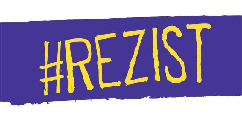
Therefore, the #rezist movement is back on the streets and on the 20th of January, the largest protest since last year was held in Bucharest, with people coming from all over the world and the country to join the protesters. The official numbers in the media stated that more than 50-60 000 people were making their voices heard and many external televisions and media outlets covered the movement. On Twitter, people reacted and posted during these days, using the hashtag #rezist (and some other custom made ones).

Each one of ous, in the resistance, has a duty to help somehow. I chose to do a map. For me, it was a perfect opportunity to get my hands on a good dataset and put my mapping skills to work without too much effort. And this is where the beauty of online mapping services. One can make a map in no time for free and show something meaningful to the world, and it is not even necessary to be a programmer or a cartographer. Ha!
There are numerous services, like Mapzen (RIP), Zeemaps, Mapbox, Scribble Maps, Maptive or others, even Google Maps or ArcGIS WebApps (though not entirely free and it is subscription based), that allow you to create something nice, from scratch. I, like CARTO (formely known as CartoDB), which super simple to use and intuitive and comes also with some powerful free features (custom CSS and HTML, build in widgets and analysis options, useful basemaps, and the list goes on), that will allow you to create simple maps. And the guys running this are great!
This idea of mapping the protests is not new. I’ve dealt with social media data for my BA thesis (where I’ve analyzed social tendencies in territorial planning using social media data from Facebook and Twitter, an idea I stole from Ed Manly, the super guy from UCL that does super things, and applied it on Romanian pages and content). I’ve also had a presentation on the Geo-spatial.org seminaries in April 2017, at the Faculty of Geography in Cluj Napoca, about mapping the previous wave of protests (unfortunately the map is no longer available, sorry for that) and the same idea drove me to this second map of the protests from last night. What I did, was to copycat the concept and spend two hours making some nice visuals. Here’s how:
The dataset:
Well, for a map to become a map, you need a dataset, obviously. The cleaner, the better. Mine was a pile of tweets, I’ve managed to download using CARTO’s Connect to a Twitter dataset feature. Important thing: this is a business account feature so it won’t be visible by default in an individual account. I do not own a business, so I did what every interested person would do when he or she does not understand why on Earth they have a tutorial for a non-available feature: I’ve emailed them! Fortunately, they did answer and when I’ve explained why I need the tweets, they were super open and thrilled at the idea and encouraged me to map on with the activation of the service for 10000 tweets. Quite enough. Did I tell you these guys are amazing?

I’ve used much of these for the previous map, obviously, but I got a few left, so today I used the leftovers to scrape the Twitter again and retrieve what I needed. Of course, I did some research before: which hashtags are important, how to narrow down only to the relevant tweets, etc. I’ve stayed with those who contained #rezist. That was enough for me.
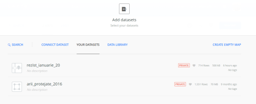
Note: The tweets are automatically downloaded and put into a table structure (from where you can download them as csv, shp and a couple other relevant formats). The dataset is automatically uploaded into your repository and even creates a default map. There is a particular structure that apparently is very important for any further manipulation, therefore I did not change any of the data types or the structure of the table, only some column names. Do not mingle with its feng-shui!)
The map:
Easy peasy…It has already been created when I’ve downloaded the dataset. Well, in a bare, unappealing manner. So I did:
- Changed the basemap: you have quite a few options to do that. I like the dark one from Carto (Dark Matter lite), not only because it enhances tweets, making colored points to pop up and suits an animated dataset, but also because it is one of the official #rezist colors. But for your own map, choose whatever, or bring your own (you have this option… neat!)

- Enable map options: First of all, please go to the map options tab in the left (the one with some line controls) and tick the Search Box, Zoom Controls, Legend, Leyer Selection, Toolbar, Scroll zoom wheel. VERY IMPORTANT! :)

- Styled the layer dataset: Well, for this map I have the same dataset, duplicated. Why? Because I needed both the dynamic effect and the static effect. Therefore, I’ll split this step in two:
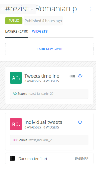
- Dynamic dataset: Rename it into something appropriate and click Edit, go to Style (ignore other tabs) and choose the Aggregation type to be animated. Then you’ll play with colors (obviously I had to go with some yellow, specific to the #rezist movement), blending, strokes, overlap, and dynamics as you wish. For tweets to be sorted out and animated in a timeline, choose the column that says posted time. A nice timeline widget will appear, which you’ll also customize later. Not only that but in the Legend tab, you’ll choose a custom legend and specify a denomination and general color for the points. Skip the title, it is not important, you’ll have the name of layer anyway. A nice legend should appear on the map.


- Static dataset: the same operations are applicable: rename, edit, style and leave the aggregation to By Points. Choose a size, color, stroke and blending (I like screen, it’s nicer on this kind of maps). Go to the Legend tab and repeat the steps above.


Now, getting back to the main panel, you’ll see that you have two options: Layers and Widgets. Cool, you can add custom widgets to do stuff. Data cool!
4. Widgets: In widgets, you’ll already have the Posted time widget, which was created by default when you chose to aggregate the first dataset in an animation. Rename it into something nicer than some column name and edit it. You can specify the time zone, how many buckets (little columns you want to see) and the time frame (hourly, daily, weekly, monthly). For me, was obviously hourly. I wanted to also be a dynamic widget and the data represented to change accordingly when I make any move on the map (e.g Zoom in). Enabled that. Also, I’ve chosen some yellow color to match my yellow points and checked a couple of times if the cursor is on track. Good. I can now Show local time, Play, See totals and select only those timeframes I want directly through this little panel.


Moreover, I thought that since I have tweets spread all over the map, I want to see which languages were used. Since the dataset comes with a column where language is recognized, I had to use it. Therefore, I’ve added a new widget, called it Tweeting languages and edited it. I used the Category Type, and aggregated by twitter_lang, by counting them (operation COUNT). Just as before, thought a little dynamics wouldn’t hurt and set the color to yellow. The same yellow. To make it look more stylish, I added a suffix, that will specify what on is actually counted there. The widget is veery nice. Appears on the top right, lets you see the first relevant options and even lets you filter when searching for a specific language (here language code. Ex: Arabic is AR), or select those already on display.


A second widget I thought I might add, was a total tweet count. Ok. Not all tweets that have #rezist were downloaded, but only those who contain location and can be geocoded. There may have been more than 700 (the number I got), but only those were on my map because other are filtered out at download. It is a nice feature that CARTO has and eases a lot of your work. If you need all of them, you’ll have to find another service or work your Python magic through Twitter’s API.
Aha, so have 708 relevant points on my map, therefore I choose to create a new widget, specify I want it to be a Formula type, and my operation would be Counting the ID (hmm…so COUNT(cartodb_id)) which is the ID given at download to each point (ObjectID or FID). Rename the widget for a title, make it dynamic and add a little description to avoid confusion when numbers change.


The same operation repeated will give you the Retweets widget, which I used for measuring engagement. Ta daaa!
Now, remember I activated all these widgets in the first layer (the dynamic one). The first one is dedicated to this layer, and any changes on the map will only be visible if the layer is active, but the other two will also be affected even though the first layer is off and the static one is on.
All you need to know is to make sure all changes go well and hit the Publish button! A link and some share options will get your map in the world.
My final map of the #resist protests on the 20th of January looks like this and can be consulted here for a full and nicer version than the embedded one:
Hopefully, this will shed some light on the scale of support people in Romania get for their courage to stand up in front of corrupt politicians and the size of our battle. Any little step is valuable for the community and we can contribute with whatever skills we have. Meanwhile, people will be on the streets protecting what is left of Romania and democracy. # rezist